YouTube Description:

Examples of Form Fields in Flutter with Form Validation. The form fields and validation include text fields for name, e-mail, and password, as well as drop down, check box, and radio button.

Let's talk about adding forms to your Flutter apps and how to validate them.


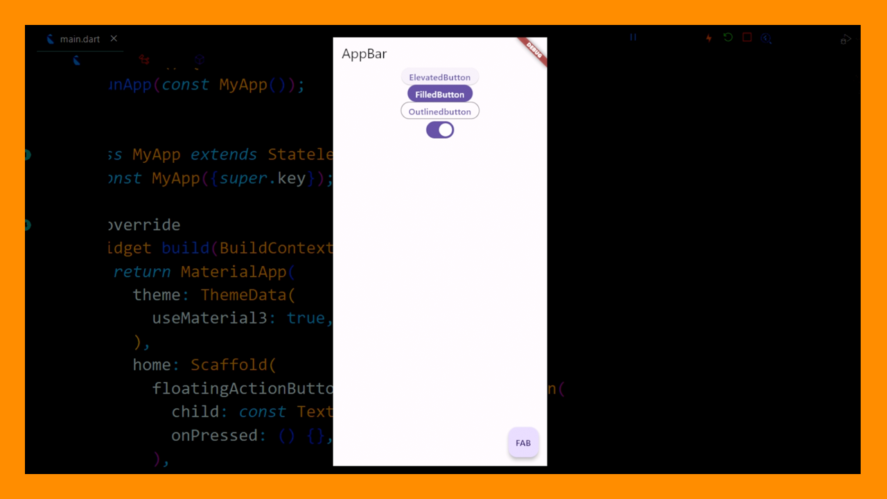
Let's build our tutorial boilerplate:

import 'package:flutter/material.dart'; void main() => runApp(const FormApp()); class FormApp extends StatefulWidget { const FormApp({Key? key}) : super(key: key); @override _FormAppState createState() => _FormAppState(); } class _FormAppState extends State<FormApp> { @override Widget build(BuildContext context) { return MaterialApp( home: Scaffold( appBar: AppBar(title: const Text('Form Example')), floatingActionButton: FloatingActionButton( child: const Icon(Icons.save), onPressed: () {}, ), ), ); } }

So you'll see an app bar and a FloatingActionButton which we will use to submit the form.


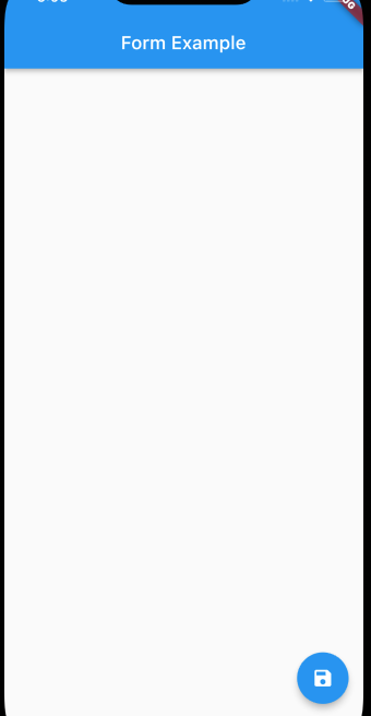
So we will go ahead and add our Form now. We will add the key variable at the top:

class _FormAppState extends State<FormApp> { final GlobalKey<FormState> _key = GlobalKey<FormState>(); @override

And then we will add a body and the form:

appBar: AppBar(title: const Text('Form Example')), body: Form( key: _key, child: const Text('placeholder'), ), floatingActionButton: FloatingActionButton(

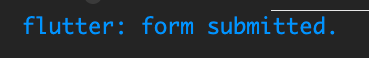
And then we will just print to the console when the button is pressed for now.

floatingActionButton: FloatingActionButton( child: const Icon(Icons.save), onPressed: () { print("form submitted."); }, ),

Press the save button and you should see this message in the console:


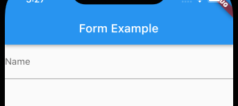
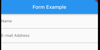
Let's start adding some form elements to the body now. We will start with a TextFormField for a users name:

body: Form( key: _key, child: TextFormField( decoration: const InputDecoration( labelText: 'Name', ), // InputDecoration ), //TextFormField ), // Form floatingActionButton: FloatingActionButton(

Now we can add some validation to the text field like this:

), // InputDecoration validator: (value) { if (value == null || value.isEmpty) return 'Field is required.'; return null; }, ), // TextFormField

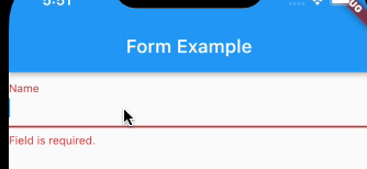
This will return "Field is required." if the field doesn't have anything in it. If it does have something in it, it will return null.

Inside the floatingActionButton's onPressed we need to validate and save the form like this:

onPressed: () { if (_key.currentState!.validate()) { _key.currentState!.save(); print("form submitted."); } },

If you leave the field blank and hit the submit button, you'll see an error!


Validating an E-mail Address is very similar. First let's wrap a column around the name field:

child: Column( children: [ TextFormField( decoration: const InputDecoration( labelText: 'Name', ), validator: (value) { if (value == null || value.isEmpty) return 'Field is required.'; return null; }, ), // TextFormField ], ), // Column

And then we will add a TextformField for e-mail address:

return 'Field is required.'; }, ), // TextFormField TextFormField( decoration: const InputDecoration( labelText: 'E-mail Address', ), // InputDecoration ), //TextFormField ], ), // Column

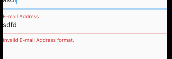
And then we add the validator to this text field as well:

TextFormField( decoration: const InputDecoration( labelText: 'E-mail Address', ), // InputDecoration validator: (value) { if (value == null || value.isEmpty) return 'Field is required.'; String pattern = r'\w+@\w+\.\w+'; if (!RegExp(pattern).hasMatch(value)) return 'Invalid E-mail Address format.'; return null; }, ), // TextFormField

It first checks to make sure the field is populated, and then it checks to make sure the e-mail address is in the proper format.


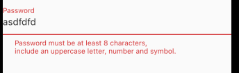
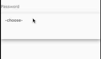
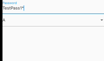
And now let's add the password field:

TextFormField( decoration: const InputDecoration( labelText: 'Password', ), ),

And then the validation section:

validator: (value) { if (value == null || value.isEmpty) return 'Field is required.'; String pattern = r'^(?=.*?[A-Z])(?=.*?[a-z])(?=.*?[0-9])(?=.*?[!@#\$&*~]).{8,}$'; if (!RegExp(pattern).hasMatch(value)) return ''' Password must be at least 8 characters, include an uppercase letter, number and symbol. '''; return null; },

It's not pretty but it'll do for this tutorial. Again we check to make sure it's not null/empty and then we check to make sure the password fits a standard password format. If everything passes we just return null.


We will now add a Drop Down, which is fairly similar to the TextFormField. Let's start by adding a variable at the top of FormAppState that will hold the drop down value:

final GlobalKey<FormState> _key = GlobalKey<FormState>(); String dropdownValue = ''; @override

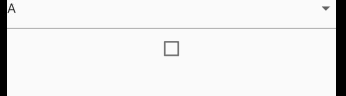
And then we will add it in the body below the password like so:

DropdownButtonFormField( value: dropdownValue, items: const [ DropdownMenuItem<String>(child: Text('-choose-'), value: ''), DropdownMenuItem<String>(child: Text('A'), value: 'A'), DropdownMenuItem<String>(child: Text('B'), value: 'B'), DropdownMenuItem<String>(child: Text('C'), value: 'C'), ], onChanged: (String? value) { setState(() { dropdownValue = value!; }); }, ),

And then we will add the validator below onChanged:

onChanged: (String? value) { setState(() { dropdownValue = value!; }); }, validator: (value) { if (dropdownValue == '') return 'You must select A, B, or C.'; return null; }, ), // DropdownButtonFormField


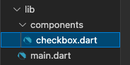
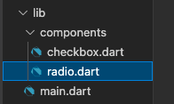
Checkboxes and Radio buttons is where it gets complicated, because these two widgets don't seem to support the validator in Flutter, at least based on my research. But there is a workaround for it using FormField. We will start with the Checkbox. let's create a folder called components, and a file called checkbox.dart:

Now inside checkbox.dart we import material and create a stateful widget:

import 'package:flutter/material.dart'; class CheckboxFormField extends StatefulWidget { const CheckboxFormField({ Key? key }) : super(key: key); @override _CheckboxFormFieldState createState() => _CheckboxFormFieldState(); } class _CheckboxFormFieldState extends State<CheckboxFormField> { @override Widget build(BuildContext context) { return Container( ); } }

At the top of _CheckboxFormFieldState let's add a checkbox variable:

class _CheckboxFormFieldState extends State<CheckboxFormField> { bool checkboxValue = false; @override

And then we will add the FormField and Checkbox:

Widget build(BuildContext context) { return FormField( builder: (state) { return Checkbox( value: checkboxValue, onChanged: (value) { checkboxValue = value!; state.didChange(value); }); // Checkbox }, ); // FormField }

Now we have to plug it into main.dart. We will import it at the top:

import 'package:flutter/material.dart'; import 'components/checkbox.dart'; void main() => runApp(const FormApp());

And then we can call it right under the DropDownButtonFormField:

), const CheckboxFormField(), ],


To get the checkbox validated now we have to do a few more things. First, we need to add a text area to display the error message when there is one. So let's first wrap the Checkbox with a column:

return Column( children: [ Checkbox( value: checkboxValue, onChanged: (value) { checkboxValue = value!; state.didChange(value); }), ], ); // Column

And then below the checkbox we will put a Text Widget to display the error. We'll go ahead and make it red also so it stands out:

}), // Checkbox Text( state.errorText ?? '', style: TextStyle( color: Theme.of(context).errorColor, ), // TextStyle ), // Text ],

Now we just need to add the validator:

}, validator: (value) { if (!checkboxValue) return 'You must check this box'; return null; }, ); // FormField

And the check box should now error out when it is not checked.


And then we can do a radio button. Let's create another file in components called radio.dart:

So once again we import material and then add a stateful widget:

import 'package:flutter/material.dart'; class RadioFormField extends StatefulWidget { const RadioFormField({Key? key}) : super(key: key); @override _RadioFormFieldState createState() => _RadioFormFieldState(); } class _RadioFormFieldState extends State<RadioFormField> { @override Widget build(BuildContext context) { return Container(); } }

We will add a variable at the top of _RadioFormFieldState to store the selected radio button

class _RadioFormFieldState extends State<RadioFormField> { String radioValue = 'Top'; @override

Add our form field and our column:

Widget build(BuildContext context) { return FormField( builder: (state) { return Column( children: [], ); // Column }, ); // FormField }

Inside the column we will add two Radio widgets and a Text widget, we'll do the top Radio button first:

Radio<String>( value: 'Top', groupValue: radioValue, onChanged: (String? value) { setState(() { radioValue = value!; }); }),

And then the bottom Radio widget:

Radio<String>( value: 'Bottom', groupValue: radioValue, onChanged: (String? value) { setState(() { radioValue = value!; }); }),

And then the text widget that will show the error message:

Text( state.errorText ?? '', style: TextStyle( color: Theme.of(context).errorColor, ), ),

import that at the top of main.dart:

import 'components/checkbox.dart'; import 'components/radio.dart'; void main() => runApp(const FormApp());

And then add it to the body below the checkbox:

const CheckboxFormField(), const RadioFormField(), ],

Now we just need to add validation to radio.dart below the FormField builder:

validator: (value) { if (radioValue == 'Bottom') return 'You must choose the top radio button.'; return null; },


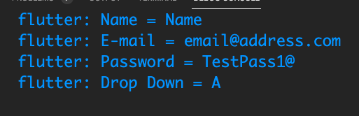
And finally we will print out all the results on a success so we can see that it's working correctly. We will start by creating an string Map called fieldValues at the top of _FormAppState:

String dropdownValue = ''; Map<String, String> fieldValues = {}; @override

We will add an onSaved to the Name TextFormField:

onSaved: (value) { setState(() { fieldValues['Name'] = value!; }); },

And to the E-mail TextFormField:

onSaved: (value) { setState(() { fieldValues['E-mail'] = value!; }); },

The Password TextFormField:

onSaved: (value) { setState(() { fieldValues['Password'] = value!; }); },

And the DropdownButtonFormField:

onSaved: (value) { setState(() { fieldValues['Drop Down'] = dropdownValue; }); },

(You can also do "fieldValues['Drop Down'] = value.toString();", should still work)

And then in the onPressed for FloatingActionButton, we'll just iterate through the Map to show the results.

if (_key.currentState!.validate()) { _key.currentState!.save(); fieldValues.forEach((label, value) => print('$label = $value')); }

Pressing the floatingActionButton should now show these results:


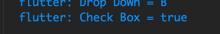
The checkbox and radio button will be a little more complicated. We will create a callback function at the top that we will pass data to in order to set the fieldValues map for those two:

Map<String, String> fieldValues = {}; setFieldValue(label, value) { fieldValues[label] = value; } @override

Then we will pass the call back down in the calls for those inside the Scaffold body:

), // DropdownButtonFormField CheckboxFormField(callback: setFieldValue), const RadioFormField(),

You'll notice we removed the const from the CheckboxFormField call.

Switching over to checkbox.dart we will add a way to store setFieldValue so we can use it on save:

class CheckboxFormField extends StatefulWidget { final Function callback; const CheckboxFormField({Key? key, required this.callback}) : super(key: key);

And then we just need to add the onSaved:

}, onSaved: (value) { widget.callback('Check Box', value); }, validator: (value) {


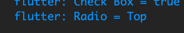
And then finally we do the same thing to the radio button, starting with the call in the scaffold body:

), CheckboxFormField(callback: setFieldValue), RadioFormField(callback: setFieldValue), ],

Set the callback at the top of RadioFormField

class RadioFormField extends StatefulWidget { final Function callback; const RadioFormField({Key? key, required this.callback}) : super(key: key); @override

And then add the onSaved:

}, onSaved: (value) { widget.callback('Radio', value); }, validator: (value) {


Source Files

main.dart | checkbox.dart | radio.dart


More Videos